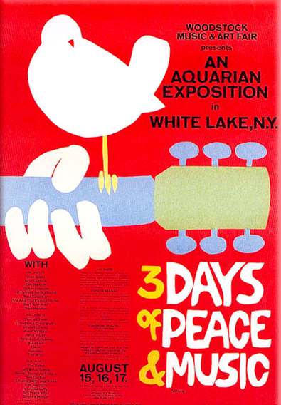
This is a poster for Woodstock a massive music festival held in 1969, it marked the end of an era for many. I chose this poster as an example because it's clear, simple and communicates a message very easily. Even if you took away all the text, the message is still clear (rock music and peace). I is also very freehand to suggest the concert will be extremely layed back and just generally a fun time.


Looking at T4 on the beach as I've never been to a festival and this is the only one that really comes to mind as a good well planned example. It clearly has a theme which is a care free summer but also looks to be inspired more by an american style surfing summer in California or Florida, this may be due to the fact T4 on the beach is geared towards a younger audience who watch a lot of american programming. I love how the brand takes blue which is the colour of the sea and also the colour of sand and not any other colours to communicate the beach without having to necessarily mention it. Colours i could use for my brand have to relate to music but i have to keep in mind the identity of the Olympics and not only that, taking into account what the lineup is.


No comments:
Post a Comment